


Building an iconography library using content design

The Nordstrom Design Language System (NDLS) team and the Nordstrom Creative team completely overhauled our iconography library. By redesigning the entire library from top to bottom, we hoped to make our icons have a consistent naming convention that was shared by both the Experience Design (XD) and Creative teams. Additionally, we sought to create a library that was easy to use and served the needs of our designers.
This was a huge undertaking and a brand-new way of working. Previously, designers within the XD team created the Nordstrom iconography library. The designers created the icons as one-offs — as the need presented itself. This resulted in an inconsistent library. I had an opportunity as a content designer to establish a strategy for naming icons and how those icons would live in a cohesive library.
Facing unique challenges
A library shared by teams with different needs presented interesting challenges.
The library contains multiple types of visual assets: icons, illustrations, and logos.
Icons are used by the XD team to represent and enhance the product space.
Illustrations, which are larger than icons, are used by the Creative team for print and digital displays (e.g., restroom signs within a department store).
Each team uses a different platform to host iconography. The XD team uses Figma and Creative uses Adobe Experience Manager (AEM).
The Creative team has requirements and restrictions related to Nordstrom’s brand guidelines for how icons are named.
Our two teams have different uses for the icons and illustrations. Still, we use the same design files. My biggest challenge was finding a way for two teams with different goals to build a shared library.
Competitive research
I needed to do research before starting the design process. I sorted through multiple design language systems from various industries to learn how they approached iconography. I wanted to see how other systems decided to name icons and how they organized icons into categories.
Taxonomy guidelines
We ultimately decided on a few key guidelines for naming icons.
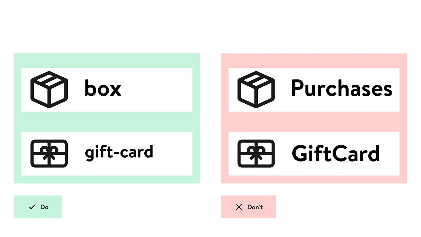
Naming icons for what they are and not for what they represent
Helps future-proof the iconography library
Reduces cognitive load
Let’s say there is an icon of a lightbulb. Lightbulbs can be a symbol for an idea, so you name the icon “idea”. A couple of years later, your team wants to use the lightbulb for an electrical component. So, they rename it "electricity". This requires your team to devote time and resources to make the change, as well as your team now having the mental effort of remembering a new name for the icon. If the icon had been named “lightbulb” from the beginning, teams wouldn’t have to learn the name of the icon because they already have a mental model of that symbol. And there wouldn’t be a need to change the icon in the future.
Setting parameters for formatting icon names
We made the following formatting choices to help increase readability and scannability:
Icon names are written in lowercase
Icon names are short, clear, and descriptive
If an icon name has more than one word, use a dash between each word
Adding prefixes
The NDLS iconography library consists of three types of assets: icons, illustrations, and logos. We added prefixes to illustrations and logos to help users differentiate between assets while using the library. Illustrations have the prefix “illus” and logos have the prefix “logo”.
Content audit
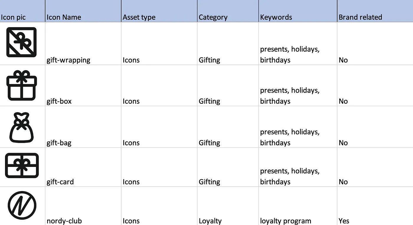
After the team decided on the taxonomy guidelines, I completed an audit, going through each asset and naming it. A spreadsheet let me record information on each asset, such as its name, category, keywords, and whether it was tied to the Nordstrom brand. It also noted if it was an icon, illustration, or logo.
Collaboration
While these taxonomy guidelines worked for the XD team, we had to ensure they were suitable for our partners on the Creative team. Through a series of working sessions, we explained the guidelines proposed by NDLS, and the Creative team explained their requirements and resources.
Creative designers don’t only use AEM for iconography. AEM houses photos and other assets too. AEM’s files all follow a particular naming format (including information like the date the file was made, what category the file belongs to, etc.). Additionally, the Creative team needs to follow brand guidelines for its asset names.
Due to these conditions, we worked with the Creative team to identify any icons that were critical to the JWN brand. This set of icons was named for what they represent within the company’s brand. We agreed to format icons in AEM in Title Case and without dashes to match other assets in the tool.
Keyword tagging
Some icons were named for what they represent. It was less than ideal. But there was a silver lining: both platforms (Figma and AEM) supported keyword tagging.
Keyword tagging is the ability to add metadata to an asset (in this case, iconography). This additional metadata allows us to add words related to the name of the icon, increasing the discoverability of the icon. Users of either platform can search for an icon using their mental model. They can also find the icon using the added keywords.

Categorization
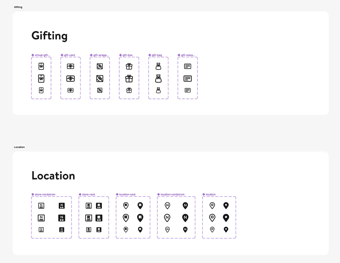
The old design of the library sorted icons into sixteen categories. There were duplications, and some icons were in multiple categories. The categories were created ad hoc, and there wasn’t much organization or reason in how the icons fit into the categories. We wanted to simplify the categories and decrease how many categories we offered. After naming the icons, I started thinking through how to structure the categorization of the new library.
With icons now mostly named for what they are, this has changed how we can categorize them. Before, if a lightbulb icon was named "idea", it could perhaps go into a Research category. But now that it is called "lightbulb", it could fit into a Tools category. This new approach allowed us to decrease the number of categories from sixteen to eleven.
Usability testing
After the library was built in Figma and both teams agreed on how to best share the icons, I wanted to test the effectiveness of the library. I created a test plan to conduct remote user tests with five XD designers. With the test plan, I wanted to focus on two main aspects:
Evaluating designers' backgrounds with Figma libraries in general: The XD team recently switched from Sketch to Figma, and the team’s knowledge of Figma varies from person to person. I aimed to find out if designers knew how to navigate Figma, turn on libraries, use the properties panel, and search for assets.
Ensure the effectiveness of the iconography library taxonomy and structure: I designed questions related to how icons were classified into categories and if those categories fit the mental model of designers. I also tested how quickly designers could search for and find icons, and then asked designers about the naming of icons and if they were intuitive.
Takeaways from testing
The testing was very insightful and made the NDLS team discover a few major items to address in the library.
Multiple designers were unfamiliar with Figma’s interface and how to install libraries. This led me to create additional documentation with tips on how to get started with Figma.
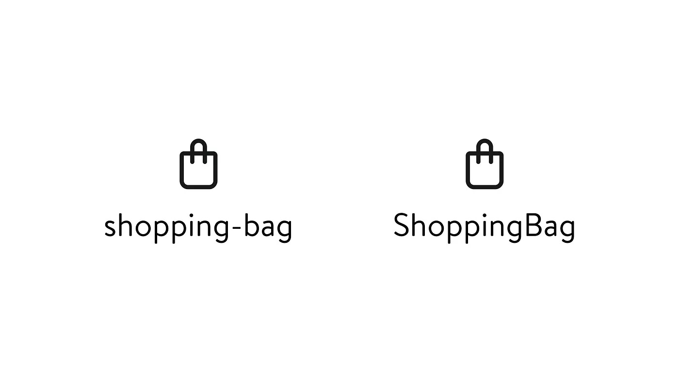
Designers were sometimes confused about the differences between icons that were named as a set. For example, icons related to shopping bags: shopping-bag-location, shopping-bag-clock, etc. I updated the descriptions for these icons to better describe their purpose.
How the library depicted icons that could only be used for a specific use case.
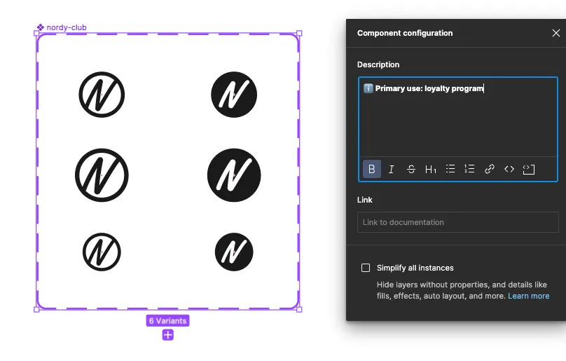
There were a significant number of icons (typically ones related to JWN’s brand) that had a singular purpose. We used Figma’s description box to label those icons as “🔒 Restricted Use”. During the testing, users were unsure what the label meant. Some thought it meant they couldn’t use the icon at all. Others assumed Figma had disabled the icon and they couldn’t use the icon in their files.
After receiving this feedback, we changed the label to make it clearer: “ℹ️ Primary use: [use case of the icon]”. This catches the designers’ attention and still lets them know how the icon is intended to be used. The designer can use any icon that doesn’t have the label however they see fit.
Creating documentation for iconography
After we validated our design decisions through user testing and applied the feedback, it was time to document our guidelines for the iconography library. I spent several weeks collaborating with my XD designer. We discussed what information was critical to include on our documentation site. This is an internal site used by many roles/teams. It's a resource for XD designers, content designers, engineers, and anyone else who needs information about Nordstrom’s Design Language System. While creating this new page for iconography, we considered what information was better suited to stay in Figma and what needed more in-depth information on the documentation site.
We decided the most important information to include was:
appearance guidelines (e.g., color, sizing, and style)
accessibility best practices
the format used for icons
which teams can use the NDLS iconography
examples of dos and don’ts for icons
access to Storybook, which is the home of our React library
Lessons learned
This was my first time building an iconography library, and I learned a couple of lessons along the way.
It’s okay to break the rules (sometimes): When I first began to create the taxonomy guidelines, I was determined to adhere to the philosophy of icon names being use-case agnostic and objective. Yet, as I went further down a list of over 200 icons, I discovered not all icons were straightforward. For instance, what about the icon that has globally been used to represent recycling? It consists of three arrows that form a triangle. Should it be named “triangular-arrows” or "recycle"? Despite wanting all icon names to follow the same structure, there are some outliers in our taxonomy that just make sense.
If an icon is universally recognized or associated with a certain product or service, use the name that already matches people’s mental models.
Collaboration: I learned the value of compromise and working together as a team. While we would be sharing the library, we were striving for different goals. Creative is an expert on print materials. They needed new icons and illustrations to represent Nordstrom's services. At the same time, XD, an expert on the digital experience, found that the previous library was outdated and no longer met the needs of the XD team. It took multiple working sessions to discuss the goals of each team and why it was necessary to meet those goals. This resulted in both teams trusting each other’s expertise and making compromises to create a final product — a new iconography library.
This was a huge opportunity. We could redesign our iconography library and collaborate with our Creative team partners. In many companies, the Creative/Marketing and Experience Design teams rarely communicate. Their areas and resources overlap, but they don't work together. We had a unique chance for both teams to come together and solve a shared problem.
*I originally posted this article on Medium.&